 Konrad UI Design Guide 2024
What is User
Interface (UI)
Design?
Learn how UI designers turn functional requirements into unforgettable experiences by combining behavioral psychology with modern scalabality

The Basics of UI Design
What is a User Interface (UI)?
User Interfaces describe the “surfaces” where people interact with machines. These surfaces come in a variety of forms and engage with multiple senses to relay information back and forth.
When developing a digital product or service, the user interface includes everything users interact with directly. Thus, usability is critical factor when designing user interfaces, especially when they are meant to be used frequently or by many different people.
What is UI Design?
User interface design is a discipline dedicated to maximizing the usability of human-computer experiences. This encompasses everything from the visual layout of a consumer-facing landing page to the typography of industrial control systems.
Within the context of the complete design thinking process, UI Design typically begins in the mid/late Prototyping step. During this time, UI designers work closely with UX research and UX design teams to understand the interaction requirements.

What are the types of User Interfaces?
A simple way to describe the types of user interfaces is via the senses with which we interact with them; i.e., vision, hearing and touch. Most of the interfaces we use today are graphical user interfaces (GUIs) which combine visual and physical interface elements (such as computers and smartphones).
- Visual UI: screens, websites, applications
- Tactile UI: physical or digital buttons, feedback (ex. vibrations)
- Gestural UI: swiping, expanding, scrolling
- Voice UI: “OK Google”, “Hey Siri”
Graphical User Interface (GUI)
A GUI combines both a visual display and a physical input, allowing real-time visual interaction with computers. Before GUIs, interfaces were limited to primitive punch cards and command lines.
Another type of user interface is the “invisible” interface. Invisible interfaces are those which present no barrier to the user experience. For example, an automatic sliding door anticipates the user’s intention and opens without any conscious input. This makes it very easy to walk into your grocery store, and the same idea holds true for digital doors.
What is UI Design vs UX Design?
Given how closely connected UX and UI are, it is not uncommon for designers to perform both roles as “UI/UX designers”. That said, each discipline brings a specific perspective to the user-centered design process, and both are needed to create the most usable experience.
UX designers are often more heavily involved with user research to determine which features and functions are needed, while UI designers determine how to make them as usable as possible.

What are UI Design standards?
Imagine if every keyboard you encountered had a different layout for the keys — they would be virtually impossible to use.
This intrinsic need for consistency underlies all of UI design, and is the reason why established standards are so important. One of the most well-known design standards is the Web Content Accessibility Guidelines (WCAG), also known as ISO/IEC 40500. These standards help to ensure all online content is consistent and accessible by people with a range of abilities. Another standard, called ISO 9241 (ISO is the international standardization organization), is a wealth of best practices for anyone involved in developing user-centered design solutions.
ISO 9241
Within UI design circles, ISO 9241 is something of a celebrity. Officially called the Ergonomics of Human System Interaction, the standards describe modern best practices across everything from physical devices to digital controls.

User Interface Examples
In today’s connected world, examples of user interfaces are everywhere. From the device you are currently using, to the guide you are currently reading, all of our interactions with machines are mediated by a UI, and can benefit from UI design principles.
While there are countless examples of well-designed user interfaces, below are some recognizable examples that stand out across both physical and digital spaces.
Physical UI Examples
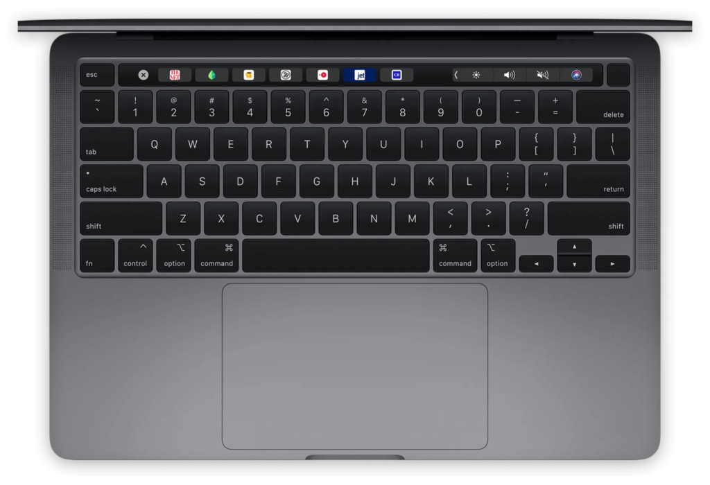
Physical user interfaces are devices we use every day. From the keyboards we type on to grocery store self checkouts, we spend a significant part of each day interacting with physical user interfaces.
In fact, the keyboard is the canonical example of user interfaces. While early keyboards were purely physical experiences, modern keyboards — like the one on Apple’s MacBook Pro — have evolved into hybrid interfaces that include multi-touch gestures (trackpad), voice UI (Siri), and visual UI elements (magic bar).
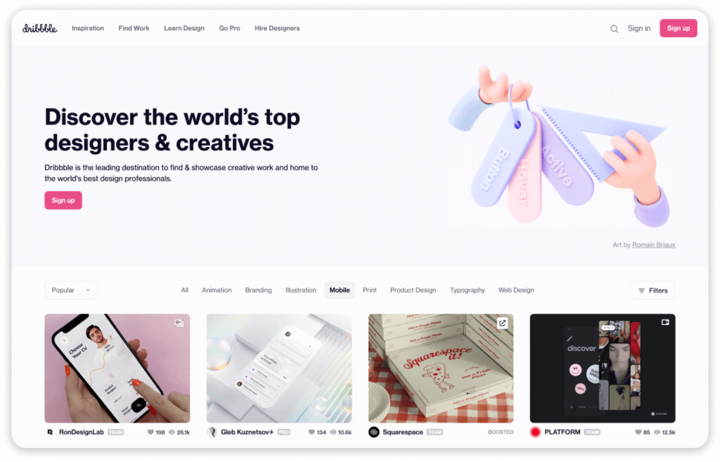
Digital UI Examples
Most modern UI examples exist purely in the digital realm. Yes, they rely on devices like smartphones to provide the core functionality, but what happens on the screen is entirely within their control. That includes the placement of buttons, proportion of elements, and layout of the entire interface. Websites and applications are the most common digital UI examples, but anything with a screen/display falls within this category.

The Principles of UI Design
UI Design is user-centered design
The principles of user-centered design are behind every user interface design decision. That means desirability (will people want it?), feasibility (can it be made?), viability (is it sustainable?) must be considered at all times. This keeps interface design focused on user goals, and fixed within the realm of possibility. You can learn more about user-centered design in our Introduction to Design Thinking.
UI Design emphasizes usability
As the “last line of design”, UI designers are responsible for developing a highly usable interface that consistently meets or exceeds user expectations.
Usability is a measure of how easily a user can interact with an interface. Even the most desirable features and functions will fail to gain traction if the interfaces to access them are difficult to use. Highly usable interfaces require little or no explanation, whereas poor usability feels opaque and unintuitive, leading to anger and frustration.
So what defines usability in user interface design? What makes one interface more usable than the next? It can be helpful to consider three facets of usability as defined by the ISO:
- Effectiveness
- Efficiency
- Satisfaction
It’s interesting to note that, while the effectiveness at achieving user goals is important, it isn’t the only factor influencing usability: the efficiency of the interaction, and the satisfaction is produces must be considered equally.
Usability is the extent to which a system, product or service can be used by specified users to achieve specified goals with effectiveness, efficiency and satisfaction.

Effectiveness
User Interfaces are designed to let people control machines simply and easily. The ability to control and complete tasks as required is referred to as the effectiveness of the interface. Effectiveness can be measured directly in usability testing through conversion rates and other metrics.
Efficiency
Just because you can complete a task, doesn’t mean it the process wasn’t wasteful. The lens of efficiency ensures UI designers are always cognizant of the time and energy required on behalf of the user. This is where reducing cognitive load through means such as progressive disclosure become very valuable.
Satisfaction
Ultimately, the most usable interfaces are also the ones that people enjoy using most. Which is to say: good design has the ability to turn mundane tasks into satisfying experiences — a powerful differentiator in today’s competitive market.
About the Aesthetic-Usability Effect
One of the major differences between UX and UI is the importance of aesthetics, or simply how “good” things look. This is because interfaces that look better are more usable — even if they are functionally equivalent to less-aesthetic alternatives.
- Aesthetically pleasing design creates a positive emotional response
- Positive responses reduce distraction which improves performance
This is called the Aesthetic-Usability Effect, and it was first described in 1995 by researchers at the Hitachi Design Center. While studying the usability of 26 different ATM interface options [1], they observed how perceived usability was more closely correlated to the apparent beauty of the button layout than its inherent ease-of-use.
These observations have been confirmed multiple times since [2], and all UI designers today appreciate the role aesthetics play in the acceptance, use and performance of any design.

The User-Computer Interface
Our interactions with computer interfaces can be modelled as two continuous feedback loops converging on a single space, or interface.
- The user loop begins with our perception of the interface (Look), which creates rational (Think) and emotional (Feel) responses, and results in a change to the interface (Do).
- The machine loop begins a change in the interface (Input), which triggers programmed processes (Logic), and returns the result (Output) to the interface.

While the complexity of the human-computer interface (HCI) is beyond the scope of this guide, it can be helpful to consider a few characteristics involved as they pertain to the design of user interfaces.
The User Feedback Loop
When we engage with a user interface, what really happens? What are we thinking? What thoughts are raised? What factors are influencing the experience? How does it make us feel? When it comes to the user feedback loop, “look and feel” play a leading role. This is (for now) the major difference between the human vs machine aspects of user interface design: machines are predictable, people are emotional. And interfaces need to be both.
“It is now understood that a wide range of emotions plays a critical role in every computer-related, goal-directed activity.”
- LOOK
The first impression
The truth is that people always judge a book (or any other interface) by its cover. It’s human nature, and it happens fast. In fact, it takes only 50 milliseconds to form an opinion about an interface. For reference, that’s 5X faster than it takes the brain to recognize a single word (~250 ms).
This means that the “look” of the interface is absolutely critical in setting the interaction off on the right foot. Does it look new? Interesting? Trustworthy? If the look is off — or not consistent with expectations — the engagement will begin on thin ice, and will likely be cut short. And those expectations are heavily influenced by the world’s most popular interfaces (Facebook, Twitter, Youtube, Chrome, iOS, etc), which are constantly innovating to increase usability.
For example, if you hadn’t updated your website in 20 years, it would look quite “dated” to most users within moments of seeing it — even before they knew what it was about. Thus, opinions about your interface will start being formed long before you can plead your case. When designing a UI, UX research methods like eye-tracking, concept testing, and card sorting can be helpful tools for benchmarking the impression your current interfaces are leaving.
- FEEL
The human connection
Once you’ve perceived an interface (or a change in an interface you’re already using), you will immediately begin to form an emotional response. When discussing this response, it is helpful to differentiate between three related terms: Emotion, Mood, and Sentiment.
- Emotions are acute feelings in direct response to an object, ex. feeling pride about a success
- Moods are baseline feelings that underlie our experience, ex. feeling care-free or concerned
- Sentiments are biased feelings based on experience, ex. “I love espresso”, “I don’t like to swim”
Maslow provides a helpful framework for understanding human needs and goals. By considering his description of the eight categories of needs, we can better appreciate the broader role that our interfaces are playing within the lives of our users.
Eight Basic Needs (Maslow, 1968)
- Physiological: Need for food and water
- Safety/Security: Need to be out of danger
- Social: Need to be with others, to be accepted
- Esteem: Need to achieve, be competent, gain approval and be recognized
- Cognitive: Need to know, understand and explore
- Aesthetic: Need for symmetry, order and beauty
- Self-actualization: Need to find self-fulfillment and realize potential
- Transcendence: Need to help others find fulfillment and realize potential
When interfaces support one or more of Maslow’s basic needs, they have a positive effect on our emotional state. Alternatively, when they impede our progress, we interpret them as negative. Most interfaces affect several needs, for example: Someone who successfully edits a vacation video may be addressing their social, esteem, cognitive and aesthetic needs at the same time to varying degrees. Capturing these actionable user insights is the primary reason to create user personas.
- THINK
The conscious consideration
During the “Think” stage, users actively weigh their options based on the available information. For example, they may be considering the implications of:
- Changing a setting
- Deleting a file
- Making a purchase
- Writing a review
In each scenario, users must weigh the consequences of their actions against their needs and goals, and UIs are responsible for providing the information required to decide.
This type of analytical thinking is akin to “System 2” in Daniel Kahneman’s Thinking Fast and Slow [4] — that is, slow, effortful, logical, and calculating thinking. It is the type of thinking applied to complex situations, such as comparing the value and attributes of two products or determining the appropriate social behavior.
User interface designs must always be cognizant of the amount of conscious consideration required for users to act. If the interface is asking too much — or too much at once — a progressive disclosure approach may help simplify the interaction (i.e. parsing out an interaction across multiple screens instead of asking everything at once).
System 1 System 2 Intuition Patience Involuntary Concentration Effortless Arduous Innate Analytical Rapid Slow Reflexive Reasoned Attributes of brain systems, Thinking Fast and Slow [4] - DO
The next interaction
The final stage of the user feedback loop is “Do”. This is where the intention becomes action — and the interface needs to be ready. Because when every extra click can cost you valuable conversions, it’s critical to give users the options they want at their fingertips.
When designing user interfaces, it’s important to remember that unlike machines, there is a gap between what we intend to do, and what we actually end up doing. This is especially true when we’re multi-tasking, or distracted by powerful emotions. In these situations, the user interface must present controls in a very clear and consistent manner, or else the risk of user errors and subsequent frustration will be significantly increased.
The Machine Feedback Loop
While it’s important to consider how people interact with interfaces, it’s the machine side of the interface-equation is where UI designers get to flex their control directly. Here, between the user input and system output, UI designers can decide exactly how to interpret requests and display information to maximize usability.
- Input: UI inputs are the levers that control digital experiences. They are the buttons, menus, canvasses and form fields that users engage with directly, and thus designing them for maximum usability is a critical part of the UI process. Even seemingly simple things, like rules defining form-input syntax can significantly affect conversion rates, and must carefully considered.
- Logic: User interfaces are responsible for relaying what users want to the relevant systems. Are they signalling the intention to change screens? Or compare data? Post new content? Or review a product? This integration between user goals and system logic is first considered during the early UX research and design process, and comes to fruition during user interface design.
- Output: The output stage is where the results of a user query are repackaged in a way that people can understand. And because (most) people do not speak in code, this translation step can be formidable. But with help from content, strategy and technology teams, UI designers can ensure the outputs are intuitive and actionable, regardless of content or complexity.

Designing User Interfaces:
Think SCALABLE
The usability of any user interface is largely defined by its consistency — both within the experience itself, and in relation to other similar experiences. And even though most users are not UI/UX designers with pixel-perfect tendencies, we all have a surprisingly strong ability to sense when things “looks out of place” — even if we can’t articulate why.
Because not every team has the design resources of Google or Facebook, achieving the level of UI consistency that today’s users expect requires a highly scalable approach. The SCALABLE method is a simple acronym for guiding usable interface design:
A consistent approach to each of these facets will ensure your interface is intuitive and usable. You can use the SCALABLE method to evaluate an existing user interface (for example, using a heuristic analysis), or while establishing a component library or UI design system for a net-new solution.

Size tells users where to look

Size comes first in the SCALABLE UI design method, and rightfully so. The size of elements within an interface is the most immediate and universal cue for users, and one that is critically important to ensure consistency. For example, imagine how confused you would feel if the body font size changed from screen to screen. While sizing errors aren’t often so egregious, even small issues can have dramatic effects.
Not only must UI elements maintain consistent size throughout — they must also maintain relative proportions to other objects. Bigger means more important — especially when screen “real estate” is limited — and there can only be one most important thing.
Color creates emphasis and environment

The inconsistent use of color is a common UI error, and primary source of confusion for users. This is because color is a rich source of information and can quickly become overwhelming to users. And when you consider how variable our vision is (1 in 12 men are color blind), it’s clear how the simple, consistent application of color can significantly improve usability.
While the design of UI color palettes is a complex topic that must consider accessibility, branding and cultural context, it’s important to take a critical eye to your color choices: What purpose are they serving? Do they always serve the same purpose? Will users understand what this color means? Keep these answers consistent across the interaction for maximum usability.
Aesthetics help to start the conversation

As discussed above, the aesthetic-usability effect is a well-documented observation whereby interfaces considered more aesthetically pleasing are inherently easier to use — even if the functionality is identical to a less-beautiful/more-utilitarian interface.
In practice, there are many aspects that influence our perception of aesthetics, including style, cultural context, and perceived intention. However, regardless of the interface, creating a consistent aesthetic throughout the experience is important for keeping users interested and on-task.
Layouts make life easier


While UX designers are typically responsible for determining which features and functions should be present, it’s the job of UI designers to present those elements in the most usable arrangement. And when you’re developing for high-traffic interfaces such as mobile phones, there are many deeply entrenched expectations to consider such as the layout and location of website menus or confirmation messages.
When designing the layout of any user interface, it’s important to consider the expected sequence of engagement. This sequence describes how your users’ attention travels across the interface, and it helps designers select the most intuitive layout. By placing the right piece in the perfect place, UI designers are able to creative interfaces so intuitive it’s as if they can read your mind.
Alignment balances complexity

In order to maximize usability, UI designers must constantly be balancing the complexity of the interface with the need for context and control. Too many choices can be paralyzing, while too few can be equally frustrating. By visually aligning all the elements in an interface, UI designers can break down complex arrays into simpler groups without reducing the number of options.
Borders divide features and functions

Nowhere is the power of a pixel more apparent than in borders. A close relative of alignment and layout, borders a powerful tool for segmenting digital spaces. They can be used to define the shape of inputs and fields (like the Google.com search bar), or divide regions or concepts (like Amazon’s “add-to-cart” area).
Borders can be created with more than just lines, too. Color contrast can perform a similar function, and is another way to integrate the concept of borders into interfaces.
Language guides the interaction

While UI designers are not expected to be copywriters, they are responsible for ensuring users always know where they are and where they’re going. And that means considering and collaborating on all the words in the interface, from the labels and form fields to menus, buttons and error messages. Guidance text is particularly important, and typically well within the UI wheelhouse.
And because text takes up space, there’s also a visual element of language to consider: The most aesthetic and balanced user interface design can be ruined by unbroken walls of body copy or heavy titles that span multiple lines. When designing scalable UIs, it’s best to define minimum and maximum character counts for key components or areas.
Effects fascinate and engage
With such a strong focus on consistency and usability, it’s easy to forget a basic fact: People love to be surprised. Of course, nobody wants an unpleasant surprise like a pop quiz or a flat tire. But delightful surprises, no matter how small, can improve engagement and recall. Even micro-animations, like the little underlines we use for our headers here, can make a significant difference to the overall user experience.
In web experiences, UI effects are best triggered by an interaction, such as hovering over a link (mouseover effects), clicking on a button (pop-ups or toasts) or scrolling down a page (parallax effects or scroll-jacking). Without this sense of control, it can be easy for your well-intended effects to frustrate users — like websites with auto-play music.

UI Design Patterns and Systems
What are UI Design patterns?
UI design patterns are the reusable components that designers build and borrow to create scalable experiences. A common example of a UI pattern is the breadcrumb, which helps users retrace their steps within a digital interface. By predefining the various patterns, UI designers can significantly improve the consistency and cohesion of the overall user experience.
What are UI Design systems?
UI design systems are the complete library of patterns and components needed to create consistent, usable interfaces. Design systems often work in tandem with “brand guidelines”, which perform a similar function for ensuring a consistent image is presented. The primary difference between the two is that design systems provide all the pieces required for building new interfaces, while brand guidelines focus more on consistency in values, voice and tone.
5 Benefits of UI Design Systems
- Consistency
- Agility
- Scalability
- Time-to-market
- Brand recall
Popular UI Design Systems
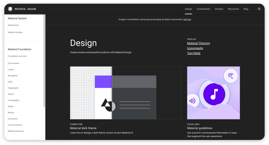
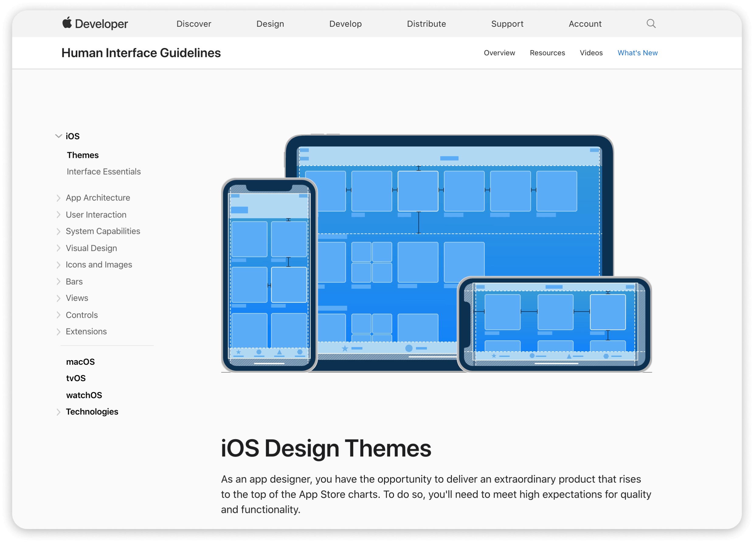
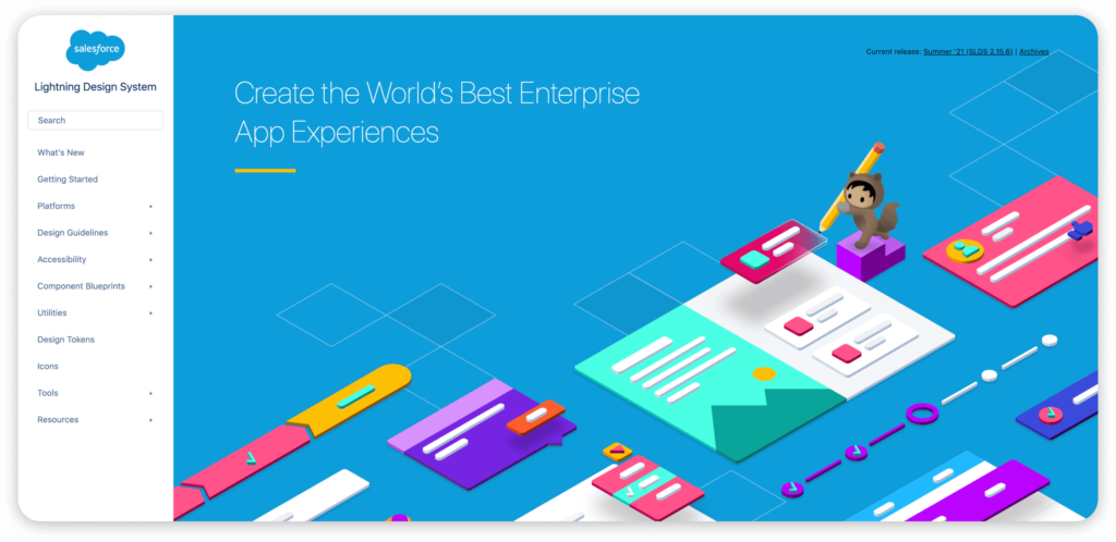
Given the benefit of a consistent user experience, it’s no surprise that today’s most used platforms strictly enforce their own design systems. From Apple’s Human Interface Guidelines to Google’s Material Design, each “walled garden” comes with detailed instructions for the consistent application of elements.
While knowing the nuances of each is best left to UI designers and developers, understanding the scope of today’s most popular systems can be helpful context for any design thinking team member.
So What is UI Design?
UI design is a mature discipline devoted to maximizing the usability of a human-computer interaction. Working closely with UX designers and technology teams, UI designers are responsible for bringing functionality to life in a way that is scalable, balanced and beautiful. The process of UI design is inherently user-centered, and the principles of UI design place a strong emphasis on usability — which integrates efficiency, effectiveness and satisfaction.
To achieve the consistency and efficiency required to build complex, multi-platform experiences, UI designers develop UI patterns and design systems that serve as the framework for interface development.
Explore our other guides to learn more about the UX Research and UX Design processes that support and inform UI Design, or continue reading our Guide to Designing User Interfaces.
- Kurosu M, Kashimura K. Apparent usability vs. inherent usability. Conference companion on Human factors in computing systems – CHI ’95. 1995.
- Tractinsky N, Katz AS, Ikar D. What is beautiful is usable. Interacting with Computers. 2000.
- Brave S, Nass C. Emotion in human–computer interaction. In: Sears A, Jacko J, eds. Human-Computer Interaction Fundamentals. Vol 20094635. CRC Press; 2009:53-68.
- Kahneman D. Thinking, Fast and Slow. Doubleday Canada; 2011.